

The work on this exhibition is of finalists nominated for the 2016 Dean’s Award
Exhibition. Each department nominated a student, mainly B Tech and Honours
candidates, who demonstrated innovation and creativity.

The exhibition
comprises bodies of work from the following disciplines; Interior Design,
Architecture , Industrial Design, Visual Arts, Multi Media, Jewellery Design
and Manufacture and Design Communication (Graphic Design). This year’s winner
is Kuena Moshoeshoe, B Tech (Fashion Design)
This year’s winner is Kuena Moshoeshoe, B Tech (Fashion Design)


Kuena Moshoeshoe.
B Tech (Fashion Design)
Under Construction

The range is a
ready-to-wear multifunctional collection designed using a user-centred approach
consisting of main garments as outerwear and supporting garments. The outerwear
is mainly reversible giving the wearers an option of how they want to wear the
garments. It is aimed at young female architecture students who are exposed to
the elements due to the nature of their cause that requires them to participate
in site visitations. It is made up of 13 pieces that are heavily informed by
the end users and their academic experiences.


The range is inspired by
architecture and makes a strong reference to the appearance of buildings. This
is achieved by the use of neutral colours such as black, grey and white. The
fabrics used have protection characteristics against weather elements, such as
water-repellence and water resistance.

The fabrics used include pvc, wool, faux
leather, faux fur, mesh, cottons. The elements used to emphasis the inspiration
of architecture are use of textures that have the look of architectural
hatching which is used to identify different construction material on
construction drawings.

White binding on the see-through garments is used to
bring out the design features of the clothing. Hardware are used as trims that
represent the hardware used in buildings. Because the range was designed to
meet the needs of architectural students, it is designed in such a way that
they could relate to it from an aesthetics point of and functionality.


Matthew Edwards
Industrial Design
BA Honours
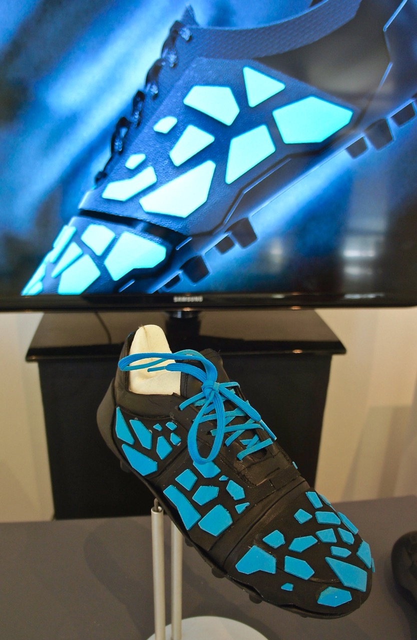
TERA Football Boot
The TERA football
boot is designed for the South African context. It is informed by South African
footballers and experts on pitch types and is designed to be affordable,
durable, repairable and suited to the pitches found in South Africa. The
Human-centered design approach to designing to solve problems helped uncovering
crucial aspects of the design.
As a football player of 15 years, problems with
durability and cost have been experienced first-hand. From games played in the
baking heat of Pimville, Soweto to the dry turf in Mahikeng, as a designer and
a problem solver I noticed a need for a boot suited to dealing with particular
socio-economic and environmental contexts.
This study revolved
around the research, design and development of a football boot that is suitable
to the conditions of South African pitches and the countries current
socio-economic climate. There is a lack of research into South African football
in general with little done in terms of context specific research into pitch
types found in South Africa and their relationship with the current design of
football boots.

The Research conducted offered insight
into the barriers faced by footballers in South Africa as well as the risks
associated with wearing the incorrect stud types on various pitches. The
literature review provided insight into the human-centered design approach on
which the methodology of the study was based. The literature review also
identified the technical elements of football boot design for manufacture. While,
sustainability was a major theme in the research, framing information on remanufacturability
and planned obsolescence.
The data collected and analysed from
interviews conducted with South African footballers presented the following
themes to inform the design of a suitable product: durability, field types,
affordability and design for repair. This information provided a framework to
base design concepts on, in an attempt to solve the problems at hand. The
study, although successful in developing a context appropriate boot for South
Africa, requires technical testing to validate certain elements like stud type,
actual durability of the
boot and elements like ergonomics. It is
also recommended that manufacturers of football boots are engaged with in order
to validate certain design decisions.
The outcome of the design seeks to
provide a boot designed, sourced and manufactured in South Africa for South
African conditions without compromising the aesthetics and quality of what’s
expected and desired by aspiring footballers.

Key Words: Football
Boots, South Africa, Durability, Human-centered Design, Sustainability, Social
Impact, Cost Effectiveness, Industrial Design, Design for repair, Contextual
design.

Naseerah Essop.
B Tech: Multimedia
This is a design
research project that is based on the principles of Human Centred Design,
Experience Design, User-Experience Design and Design Thinking. These principles
are important because I was specifically designing to alter user experiences in
order to create a preferred experience for female university students. My
design problem is the sexual violence within the University of Johannesburg. The
recent uprising of sexual violence protests in South African universities has
sparked my interest and has caused me to choose such a complex topic. This is a
topic that challenges rape culture and attempts to understand the experiences
of female students in the University of Johannesburg.
I have created a
mobile based application called ASAP as the outcome and product of this
project. This mobile application can improve the university experiences of
female students by making it safer and more reliant. It allows female students
to feel empowered, independent and a sense of being in control by helping them with
incident reporting procedures, understanding necessary information,
instantaneous contact and alerting tools. This mobile application has the
potential to help more than just female students. It could also be used by
other groups subjected to sexual violence within the university.
In order to
understand the sexual violence issue in universities from a user viewpoint, I
had to understand user experiences and motives. By understanding my users’
experiences and motivations, I have created a way to improve their experience
and situations through design. I have applied a combination of literature and
design theories in my design process and critically viewed the environmental,
cultural and social aspects of the University of Johannesburg. This has aided
me in creating a well-suited solution.
In the end, my
primary focus was to make a difference and an impact on the lives of my users
by providing them with a tool that could help them in situations of sexual
assault. As a designer, I feel that design is a powerful force that can
influence and shape how we experience life.


Alexia Ferreira
N Dip: Fine Art (2nd Year)


Crescimento
This body of work
is a visual response to Stanley Kubrick’s film The Shining (1980). The
protagonist (Jack Torrance) was my main point of reference, more specifically
his addiction to alcohol. I fixated on this because my father is battling
alcohol abuse, and working with this subject is a sort of catharsis for me.
I decided to focus
on symbiotic relationships, specifically parasitism. Parasitism is the
association between two different species where the symbiont (the smaller
organism that lives in or on the host) benefits and the host is harmed. This
symbiotic relationship in plant life can be translated into “human” form. The
parasitic plant which I have chosen to depict becomes a representation of the
alcoholic and his addiction. In this case the parasite is the alcohol and the
host is the alcoholic.
This plant is made
up of itself, with parasitic growths growing on top of other parasitic growths.
This links to the notion of the alcoholic being so dependent on alcohol that
the two “bodies” cannot be separated, despite the negative effects. These
growths also link to the film’s use of psychological misdirection where it
seems as if the protagonist is constantly reincarnated, thus suggesting that
the plant is in and of itself.

Carnality
The tea set on
display is linked to femininity and the sense of proper etiquette which finds
its origins in the Victorian era. Through subverting the material and making it
appear to be hair and skin, the tea set falls into the abject.
The physicality of
the tea set is stressed, as one can imagine the feeling of it against the mouth
when drinking from it. We have a familiarity with both tea cups and skin, but
combined, it becomes unusual. It plays on our sensory experiences and blurs the
boundaries between the living and the inanimate.

Through its
similarity to the surface of the human body the objects seem to be imbued with
sexual connotations and has fetishistic qualities. This notion of the nakedness,
exposure and ‘pleasures of the flesh’ links to women being the cause of the
realisation of sexuality and ultimately temptation, as Eve once led Adam into
temptation.

Discernment
The theme of this
work centers on Familiar/Unfamiliar and how the ‘familiar’ work of an old
master, Jan Van Eyck, is recreated and changed in order to become contemporary
and thus ‘unfamiliar’ to the spectator.
The need to portray
fertility becomes the basis of this artwork. The male figure is cast away as
the female figure is the focal point. The focus lies on the dialogue as to
whether she is pregnant or not.

Scenes from the Passion
of Christ were depicted in the mirror’s medallions. This is changed to show the
developmental stages of a foetus. This alludes to the idea that the female
figure is pregnant and these medallions are in fact “ultrasounds” of the growth
of her own child.
Painting on a
mirror becomes about perception – how we see the female figure and how we
formulate assumptions based on appearances. At the same time, the spectator
sees their own reflection in the mirror, allowing them to interact and attach
themselves to what they are seeing. The spectator becomes the other half of the
portrait, causing them to formulate questions in themselves. What assumptions
have they made of women?
By stripping the
figure of its original context and omitting elements from the composition, a
new meaning is created, one that creates a new domain of interpretation.

Raquel
Rosa Ribeiro
Design Communication (Graphics)
BA Honours
Get Tatt’d
The world we live
in is ever-changing so why shouldn’t design portfolios be a reflection of the
times? I decided to steer clear of the conventional booklet portfolio and opt
for a much more exciting medium: skin. The temporary tattoo designs you see
before you offer so much more than meets the eye. Each individual design
provides a platform for the display of my work and online portfolio. The
concept requires the viewer to apply the temporary tattoo to their skin. Once
applied, the “Layar” app should be downloaded and used to scan the designs. The
app will recognize the designs and load the relevant gif and button. Each
tattoo design either links to an animated illustration or a gif of a portfolio
piece, along with a small button that leads directly to my online portfolio.
The exhibition space has been set up to give the look and feel of a tattoo
parlour whilst providing an interactive portfolio experience.

The initial theme
of tattoos was inspired by the chief creative officer and founder of The Grid,
Nathan Reddy. Upon researching the company and its founder I noticed Reddy’s
love for tattoos and decided this would be the perfect medium in which to
briefly gain his attention whilst promoting my design skills. From here the
idea expanded and became something more. The concept of temporary tattoos which
are ephemeral, is linked to my trait of indecision as both a designer and a
person. Therefore with my designs I have taken my indecision and rebranded it
as a positive platform of self-promotion.

Mohau
Moidi
B
Tech: Applied Design
Architecture
Thesis
research study “Braamfontein night lifestyle”
Thesis
title: Illuminating the city through fashion

The story of
Braamfontein's rejuvenation has been in the spotlight over the past four years.
People's living spaces and offices that exist side by side during the daytime
are an endearing feature. Braamfontein is also home to what is fast turning out
to be a fashion district on Juta Street, where well-known fashion designer
David Tlale, among others, has relocated to. It is also home to two art
galleries: Michael Stevenson and Afronova galleries. The story of Braamfontein during the day is
however well known and has been widely spoken about.
Then what about its
night life?
Many of us have
spent time in restaurants in Sandton, Rosebank, Newtown, Melville, Parkhurst,
Midrand, Fourways, Yeoville, Norwood, Soweto, you name it. But wining and dining in Braamfontein? The
place, just like other spots in the inner-city in the not too recent past, was
an area to avoid at all costs due to a number of reasons such as perceptions
about crime, the city's deterioration and quite simply, the lack of modern,
enticing places to chill at night, such as good eateries and hotels.
That is now
something of the past.

This research study
aims to manifest into a hybrid night driven architecture that’s interwoven with
the urban fashion trends around Braamfontein and will accommodate a range of
activities. These activities will include dining bars, clothing boutiques,
clubs, public multi-use spaces and pop up store spaces. The building will also
have a hotel housing typology that will primarily cater for the nightclub
users.
The concept of the
building focuses on one primary objective of people going out in the
night. More particularly, the
subconscious tension between the male and the female in these exciting
occasions. As most males look forward to hooking up with a girl at a club, the
building also starts to express this notion in various ways. For example the triangular voids on the south
façade (which also give the building an environmental response of allowing and
optimizing passive air ventilation), express the tension between the sexes at
clubs.
The fashion
attribute of the building is expressed through the stitching of a ramp to the
building edge which also acts as a fashion runway for models allowing ample
amount of interaction from the surrounding context. The main structure is
crystalized through the 1950’s brutalist architecture which enhances the
masculinity of the concept of men and this is juxtaposed with the faceted glass
that shapes itself into a female figure which expresses the female sexuality.

In the words of
Louis Kahn “light is really the source of all being. Between lighting design
and light architecture, which will only come about through integration of
lighting engineers concerns with those of the architect so that the space
shaping power of light itself is realized.”
In achieving a
successful night driven architecture, one of the design principals used to
formalize this building was allowing the building to operate all day and all
night. A “living organism that doesn’t
rest”. This ties back to saying “light is really the source of all being”
applying it to my study it will read “light being a spine of the building that
will start illuminating the city though fashion”.

Ashleigh Wordsworth
B Tech: Interior Design
A multi-functional Craft Centre contributing to inner city skills
education and entrepreneurship while promoting craft and skill to the
johannesburg public.

This aim of this
study was to design a multi-purpose craft centre in which to conduct skills
training, production and sale of craft in Johannesburg. The design proposal
produced was informed by the research conducted and problems identified within
the craft industry. The research conducted included: literature reviews, case
studies, and interviews with current craft training facilitators. The
hypothesis of the study was that interior design could be used to create a more
conducive environment for the training, production and sale of craft. The
design was informed by concepts of urban renewal, adaptive re-use of industrial
structures, multi-functional spaces and the current state of craft in
Johannesburg. Architectural heritage and sustainability were key considerations
throughout the design of the centre. All user requirements as determined
through the research conducted were considered in the design.

The design proposal
aims to provide effective spaces for craft skills training as a response to a
demand for education and entrepreneurship in the inner city. The perception of craft is addressed through
the introduction of a public interface within the centre and exposing consumers
to the craft process. This was done in order to assist in redefining craft
amongst the public and facilitating an appreciation for the skill and value of
crafted products. The study presents a design proposal for a multi-functional
craft centre, in response to findings from research conducted into the craft
industry and supported by the relevant technical documentation.
This is a design
research project that is based on the principles of Human Centred Design,
Experience Design, User-Experience Design and Design Thinking. These principles
are important because I was specifically designing to alter user experiences in
order to create a preferred experience for female university students. My
design problem is the sexual violence within the University of Johannesburg.
The recent uprising of sexual violence protests in South African universities
has sparked my interest and has caused me to choose such a complex topic. This
is a topic that challenges rape culture and attempts to understand the
experiences of female students in the University of Johannesburg.
I have created a
mobile based application called ASAP as the outcome and product of this
project. This mobile application can improve the university experiences of
female students by making it safer and more reliant. It allows female students
to feel empowered, independent and a sense of being in control by helping them
with incident reporting procedures, understanding necessary information,
instantaneous contact and alerting tools. This mobile application has the
potential to help more than just female students. It could also be used by
other groups subjected to sexual violence within the university.
In order to
understand the sexual violence issue in universities from a user viewpoint, I
had to understand user experiences and motives. By understanding my users’
experiences and motivations, I have created a way to improve their experience
and situations through design. I have applied a combination of literature and
design theories in my design process and critically viewed the environmental,
cultural and social aspects of the University of Johannesburg. This has aided
me in creating a well-suited solution.
In the end, my
primary focus was to make a difference and an impact on the lives of my users
by providing them with a tool that could help them in situations of sexual
assault. As a designer, I feel that design is a powerful force that can
influence and shape how we experience life.


Karleigh Swanepoel
N Dip:
Jewellery Design and Manufacture
(3rd
Year)
Colletion of work 3rd Year.
I was inspired by my fascination and love of antique jewellery, in
particular Art Nouveau jewellery created by Rene´ Lalique. I was inspired by
the style of lines, balance and movement during the Art Nouveau era, as well as
the simplicity and composition of contemporary Minimalist jewellery. My aim was
to design and manufacture quality jewellery that is fresh, unique and
beautifully crafted. I used visual references from nature and plants to create
complex jewellery pieces which are also simple and elegant. Some of the
jewellery I have created can be worn on special occasions to events and
gatherings, and some of the jewellery can be worn on a day-to-day basis with
more casual attire. As a designer, I wanted to show my versatility and
adaptability in the jewellery industry.
